
✦The Findishly Journal
Fall Called. It Would Like Its Orange Monopoly Back.
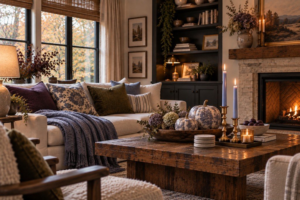
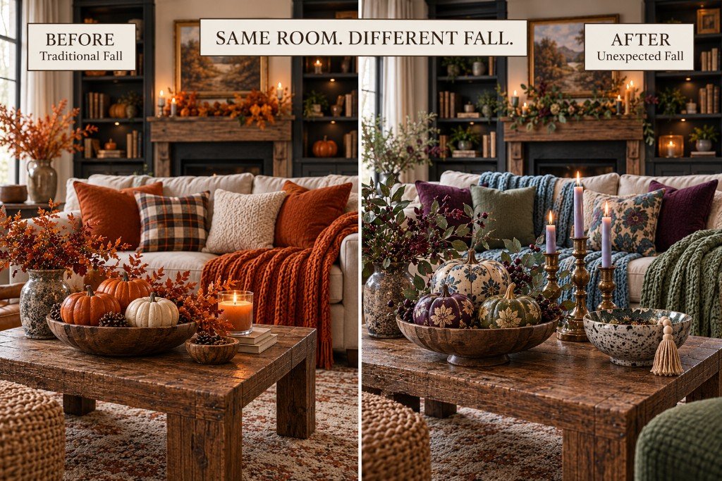
There seems to be an unwritten rule about fall decorating: September arrives, and every room in America reports for duty in orange.
Orange pillows, orange throws, rusty wreaths, burnt-orange chairs, possibly an orange mug parked on a stack of books nobody has opened since 2019.
Orange has earned its place. It has put in the hours. It has carried entire seasonal aisles on its back.
But it does not own the season.
Meanwhile, the rest of the color wheel is standing outside wondering when somebody else gets a shift.
Because fall is bigger than one color. It’s late-afternoon light, darker woods, soft fabric, worn leather, brass, dried grasses and a blanket tossed somewhere that suggests someone in this house occasionally sits down.
Which means something like periwinkle can absolutely belong there.
Yes. Periwinkle.
The Periwinkle Candles Started This
We found a set of periwinkle beeswax candlesticks and decided to put them into a fall room.
Not a spring table. Not a pastel bedroom.
Fall.
And when we built the room around them with warm wood, soft oatmeal tones and deeper autumn colors, the surprising part wasn’t that the periwinkle worked.
It was how completely normal it looked once everything was together.
Put periwinkle against crisp white with bright light and it can feel like spring. Put it beside walnut, brass, linen, caramel and deeper brown, and it becomes moodier.
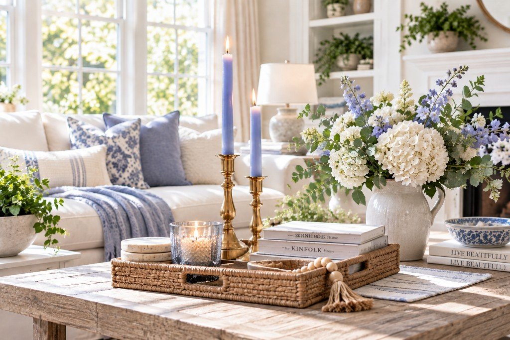
Spring Company
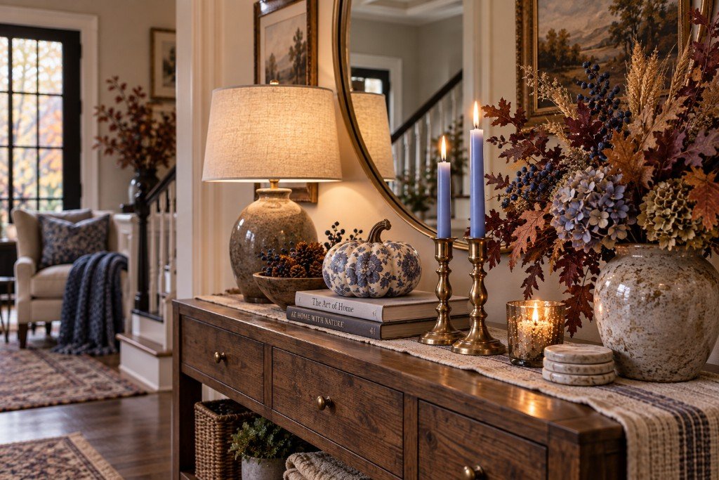
Fall Company
The color hasn’t changed.
Its company has.
That little experiment opened up a much more interesting question than What colors are good for fall?
What else have we been overlooking because we’ve decided it belongs to another season?
Fall Colors Besides Orange? Look Outside Again
The obvious place to find fall colors besides orange is the leaves.
Fair enough. Nature is annoyingly good at color.
But if you stop looking only at the leaves, fall gets much more interesting.
Look at the stormy blue-gray sky before rain. Deep purple berries. Almost-black tree bark after it gets wet. Wheat-colored grasses. Faded green leaves that haven’t turned yet. Mushrooms and stone and muddy brown earth. That dusty pink that sometimes shows up across the sky just before sunset.
Those are fall colors too.
And suddenly we have options.
A stormy blue-gray can sit beside camel leather and walnut. Deep plum looks incredible with olive and aged brass. Dusty pink gets moodier beside burgundy and dark wood. Periwinkle can work against oatmeal, caramel and brown. And olive green? Treat it like the neutral it has secretly been all along.
You don’t have to copy any of these combinations exactly. The point is to stop asking what color the seasonal aisle says fall is supposed to be and start noticing what the season actually looks like.
There’s an entire palette out there that doesn’t involve putting seventeen objects with leaves printed on them around your house.
Put those colors side by side and you realize how long you’ve been looking at fall through an orange filter.
Stormy Sky
Look at the stormy blue-gray sky before rain.
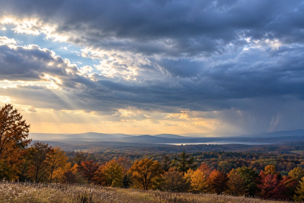
- Blue-gray
- Camel
- Walnut
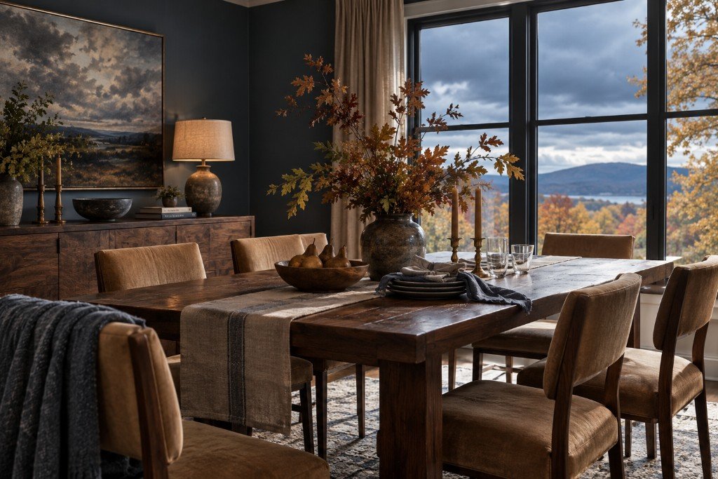
A stormy blue-gray can sit beside camel leather and walnut.
Berries
Deep purple berries.
- Plum
- Olive
- Aged brass
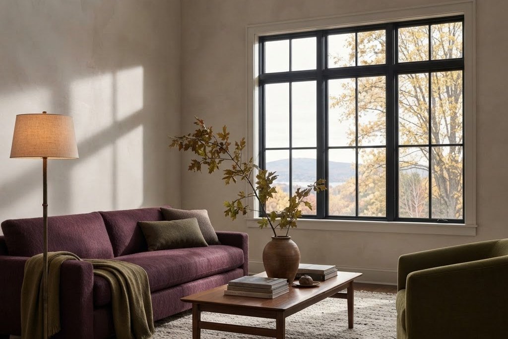
Deep plum looks incredible with olive and aged brass.
Sunset
That dusty pink that sometimes shows up across the sky just before sunset.
- Dusty pink
- Burgundy
- Dark wood
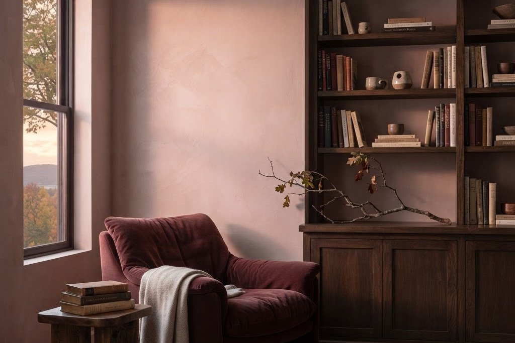
Dusty pink gets moodier beside burgundy and dark wood.
You Probably Don’t Need to Redecorate the Whole Room
Seasonal decorating has a way of convincing perfectly reasonable people that the house they’ve liked all year has suddenly become inadequate.
You don’t need a fall sofa.
Please don’t buy a fall sofa.
A room can change seasons through the things your eye notices quickly: pillows, throws, branches, lamps, candles, artwork and whatever is sitting in the middle of the table.
Swap one or two pillow covers instead of every pillow. Bring a darker throw into the room. Replace bright flowers with branches or something dried. Introduce one deeper color and repeat a smaller amount somewhere else.
A plum pillow doesn’t expire on November 1. A good brass candlestick has never once checked a calendar.
That’s the advantage of decorating with things you actually like instead of buying objects whose only qualification is contains pumpkin.
And before you buy anything, walk around your house.
The brass candlesticks in the bedroom do not know they live in the bedroom. That basket under the guest-room table isn’t under contract. The vase you’ve stopped noticing might look completely different filled with branches and moved to the dining table.
Shop your own house before you shop the store.
Your bank account has been through enough.
This section contains affiliate links. As an Amazon Associate, I earn from qualifying purchases.
You shopped your house first. Still missing something?
These six pieces bring in the color, texture and warmth behind the unexpected-fall look—without requiring your living room to report for duty in orange.
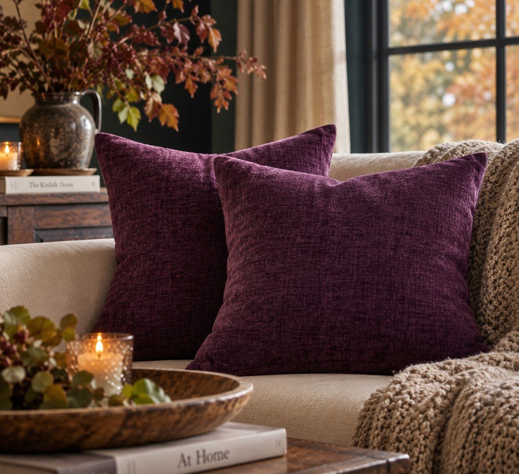
MIULEE Plum Purple Chenille Pillow Covers
Plum brings the drama. Chenille keeps it cozy.
See It on Amazon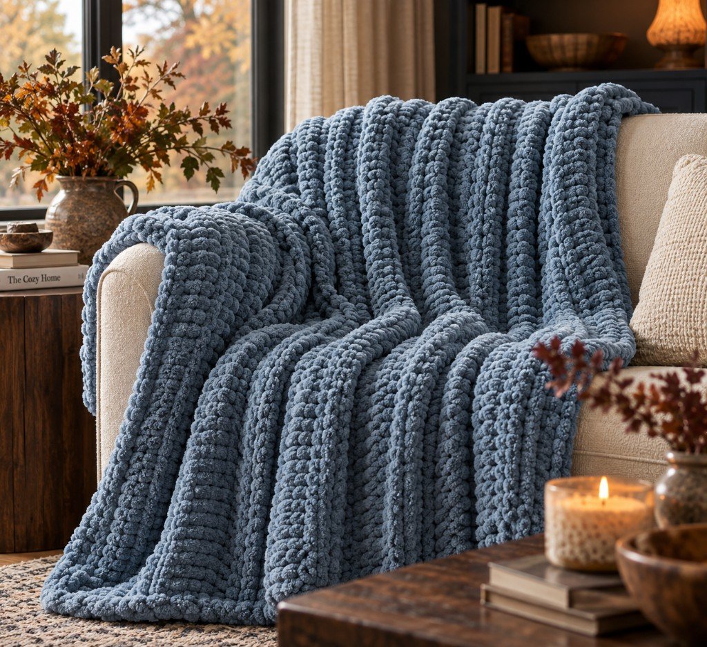
Battilo Dusty Blue Chunky Knit Throw
Proof that blue can absolutely understand fall.
See It on Amazon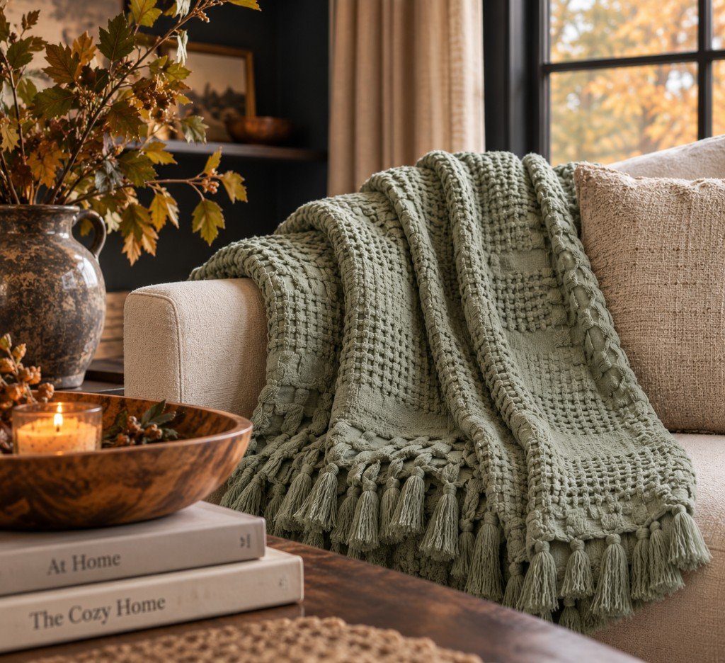
Carriediosa Sage Green Cotton Waffle Throw
A softer green that plays surprisingly well with autumn.
See It on Amazon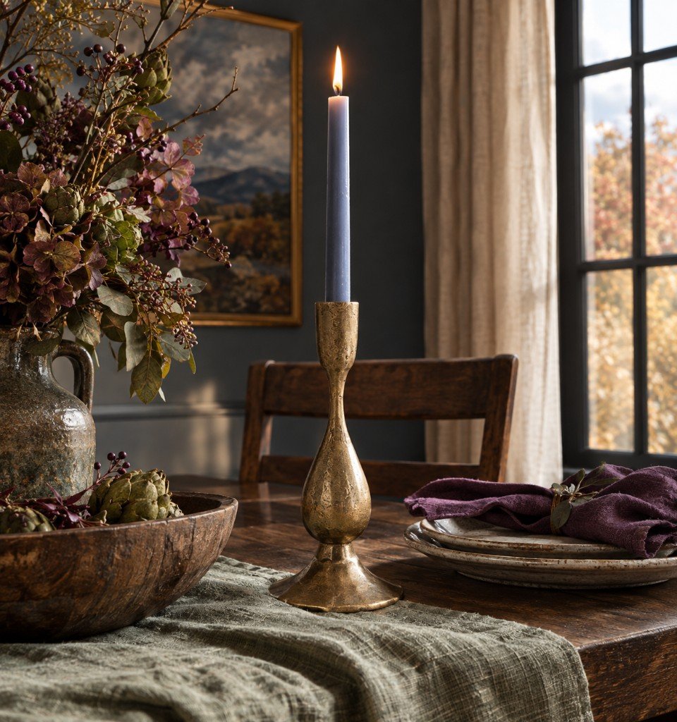
Creative Co-Op Hand-Forged Antique Brass Taper Holder
A little aged brass makes almost any color look warmer.
See It on Amazon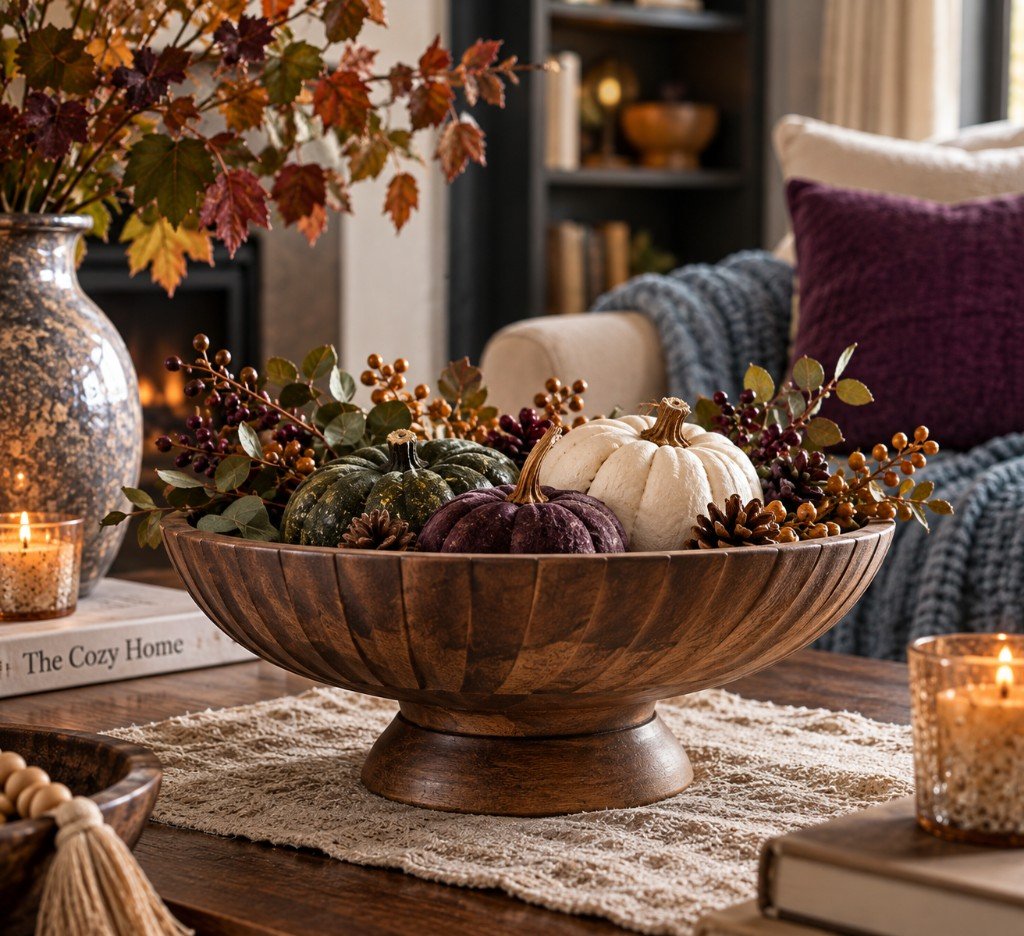
EDHAS Hand-Carved Mango Wood Decorative Bowl
Warm wood. Good texture. Zero seasonal expiration date.
See It on Amazon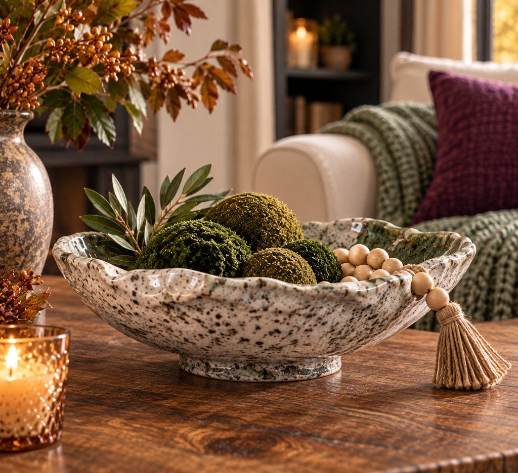
DOWAN Wabi-Sabi Moss Green Glazed Bowl
Organic shape and mossy color without a leaf printed anywhere.
See It on AmazonEditorial imagery is for styling inspiration. Product appearance may vary; use the Amazon listing for exact product details.
As an Amazon Associate, I earn from qualifying purchases.
Traditional Fall Colors Are Still Invited
None of this means we’re throwing the rust pillows into the street.
Traditional fall colors became traditional for a reason. Rust is gorgeous. So are ochre, olive, caramel, burgundy, brown and brass.
The unexpected color isn’t there to overthrow fall. It’s there to keep the palette from becoming predictable.
If burnt orange is your favorite, let it be the strongest color in the room. Then give it something less expected to play against. Rust beside dusty blue feels fresher than rust surrounded by five more versions of rust. Burgundy gets more interesting beside muted lavender. Olive and periwinkle make each other look better.
Think of it as the difference between inviting orange to the party and handing orange the deed to the house.